Groovetime
Designing and Shipping Groovetime
Designing the screens, writing the code, then making them move
Contributions
Product Design, Motion Design, Front-End Engineering
Stakeholders
Kwasi Ohene-Adu
Founder
Lloyd Lucin
Software Engineer
Aaron Aung
Software Engineer
Kirk Agbenyegah
Software Engineer
Timeline
November 2020 - December 2025
Overview
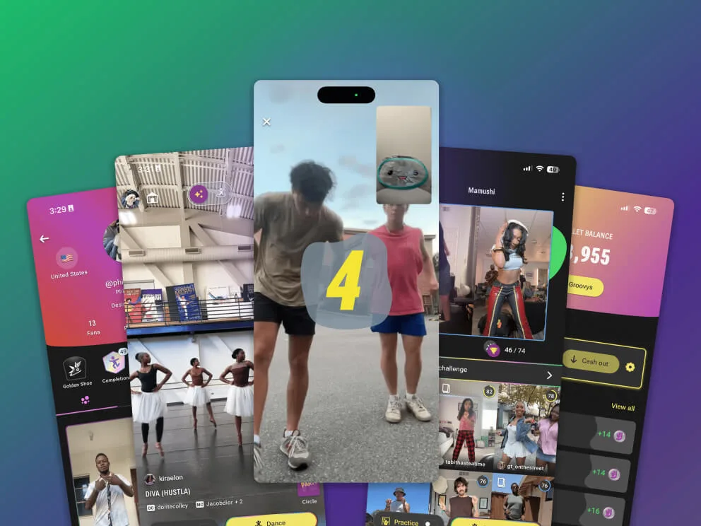
Groovetime scores your dancing through the phone camera and then makes the result social. Almost nothing in it is a static screen: a countdown runs, a score lands, a badge unlocks, a submission drops into a circle. Motion is how the product tells you what happened. I joined in November 2020 to design a dance learning app taught by real teachers and studios. It became a Web3 product in December 2021 and a social gaming app in June 2022, so the screens on this page are the third answer to what Groovetime was for. Across those five years the job I was doing changed as well, and this page is the record of both.
My Role
I arrived as a product designer and left as a product designer who can also write the front end and design the motion, and Groovetime is where those two got added. It went in four stages. For the first year I designed the screens and described the motion in specs. After the first pivot I designed the NFT marketplace and wrote its CSS, which was the first time here that designing a thing and building it were one job. Then Aaron left the company, and from August 2022 I was in the Flutter codebase implementing the motion myself and handing built screens to Kirk to wire the APIs in behind them. Rive came last, and it is what made the animation something I designed instead of something I typed.
The short version
- 01Designed
Only designer on a dance app, describing the motion in specs.
- 02Stuck
None of it got built. One engineer, and features came first.
- 03Coded
CSS on the marketplace, then Flutter when an engineer left.
- 04Moved
Then Rive, a year after I first picked it up and quit.
I joined Groovetime as its only product designer and left as one who can also write the front end and design the motion. For the first year none of the motion I designed got built, because one engineer holding an MVP together has better things to do than animate. I stopped asking for it and learned to make it.
Problem
Never Built
The motion existed in documents and nowhere else
Groovetime asks a user to trust that their phone is watching them dance and giving them a fair score, and that trust runs on timing. The countdown has to feel like a countdown. The pause on “Score incoming” has to be long enough to read as anticipation and short enough not to read as a hang. A score that lands the moment you stop dancing reads as a default value.
I designed that and wrote it into specs, and in the first app none of it got made. Lloyd was holding an entire iOS product together on his own, and each iteration went to the functionality people were asking for. That was the right call, and it left the animation as something we discussed and never scheduled.
Motion was the part of the design that never left the document. A year of specified transitions, none of them running anywhere.
Why it kept losingmotion is the easiest thing on a roadmap to defer, and it lost on all three counts
- One engineer → Lloyd was the whole iOS build, so animation competed with features users were asking for, and lost
- MVP logic → we were testing whether people would learn choreography through a phone, and no version of that hypothesis needed a countdown to feel good
- No way to size it → a paragraph describing a transition is hard to estimate, so it got deferred rather than scoped
Design
Stage One
Designing a dance learning app, from November 2020
The Groovetime I joined was a dance learning app. Teachers and studios published choreography and people learned it, and I designed that product for a year while Lloyd built it in Swift. Then it became a Web3 product in December 2021 and a social gaming app in June 2022, and each turn meant redesigning flows I had already shipped.
The app also came off Swift and onto Flutter along the way, so it could ship on Android as well as iOS. That rebuild is what the design system I had been building on the side ended up carrying. The Flutter codebase it produced is where the social gaming app on this page got built, and where I would end up working.
You can read both pivots off the screens further down. The wallet and its currency are what the Web3 version left behind. The Learn Basic Moves row on the dashboard, offering a Top Rock tutorial, is what survived from the app I was hired to design.
It was ordinary design work and it worked, for the screens. Lloyd built those from my specs, and he did not come back with questions.
Stage Two
Coding, first the marketplace, then the app
The Web3 pivot gave me a marketplace to design for the NFTs, and we built it on Metaplex. The framework brought the minting and listing flows with it, so the structure was settled before I started and the design problem became making the thing read as Groovetime instead of as a default storefront.
My part of the build was the CSS, and that is the first time on this product where designing a thing and building it were one job. No spec sat between my intent and the stylesheet, so the values I picked were the values that shipped.
It is also where the first motion I designed ran anywhere. I knew CSS3 animation and what it could do, so transitions went in while I was building instead of going into a document to wait for a sprint that never came. They were small next to what the app needed, and they were running in something a user could open.
Then Aaron left the company. The app was Flutter rather than CSS and I had not written it before, but the marketplace had shown me I could build what I designed. In August 2022 I picked up the app builds.
The brief they gave me was small: learn to tweak the widgets that already existed. Once I was comfortable there I started writing my own widgets, and after that I was assembling whole screens out of them. The order mattered. A designer dropped straight into building screens would have slowed the team down instead of adding to it.
A gap opened on the team before I asked for anything, and the part of the codebase I wanted was the part where the animation lived.
Stage Three
Motion designing, from August 2022
The job changed here, and so did the product. I built the animation into the Flutter myself, leaning on the animation packages the ecosystem already had rather than writing curves from nothing. The work was picking the right package and bending it into the thing I had drawn, then tuning it against real frames on a real device. The transitions I had been specifying for a year started existing.
Owning that step also changed the order I worked in. Building the screen yourself means designing the transition alongside the layout, because they are one problem. The framing gate before a dance is a layout and a color change at once, and it has to resolve fast enough to read as feedback instead of a verdict.
Simple motion I could handle. Anything complex still crawled, because precision comes from tweaking and tweaking comes from iterations, and Kirk had an entire app to keep running. A complex animation took weeks to ship. The motion was no longer getting cut, which was the first problem solved, and it was arriving at a rate that made ambitious ideas not worth proposing.
Stage Four
Rive, from January 2025
Package-driven animation is fine for a color change and a gate. It is a bad way to make a character celebrate. Anything expressive meant stacking packages and controllers until the behavior I wanted fell out, so how ambitious a piece of motion could be came down to how much of that I could bear to maintain.
I found Rive in January 2024 and it did not take. I spent a little time with it, decided it was harder than the problem I had, and went back to the packages. A year later I tried again and it was far less work than I had estimated.
Building the animation on a timeline with a state machine and handing the app a file to play moved the work out of the code and into a place I could design it. Hundreds of lines of widget animation collapsed into one file that controlled the whole thing. The badge landing and the profile effects below came out of that change, and I would not have attempted either one with packages and controllers.
Tradeoff
What owning the build cost
Being the only designer and writing front-end code meant the two queues competed. Time spent getting a transition right was time not spent on the next flow, and I was the bottleneck for both. Nobody reviewed my design work either, and I could not fix that from inside the role.
The design system I had already built is what made it affordable. Because the components were specified, building a screen was assembly, not invention, which is what let a designer learning Flutter be useful in it at all. That system has its own case study, including the twelve-week rebuild the first pivot turned into.
Screens
Eight flows, grouped by what they are for
This is the app as it shipped. Each flow opens to its screens and a note on what the design was solving for, and the counts are there so you can pick instead of opening all eight.
Core Flows
Onboarding5 screens: sign-in, three value slides, and the profile fields we asked for
Groovetime scores your dancing through the phone camera, which is not a thing a new user assumes an app can do. Onboarding spends three slides on it: learn a trend, play a game, climb a leaderboard. Only then does it ask for anything back, and the profile step wants a username, a date of birth, and one optional question about where they found us.


Dashboard4 screens: the home surface, and the daily try limit that governs it
The home surface: featured challenges, a Join the Party row of timed contests, and discovery rows for popular sounds and basic-move tutorials. It also carries the daily allowance, ten dance tries at level two, and a level sheet that explains how to earn more. The meter sits here rather than inside the dance flow, so you can see the count before picking what to spend it on.


Feed5 screens: vertical video, with Practice Mode reachable from the clip
A vertical feed of dance clips carrying reactions, a dancescore badge on scored takes, and the circle each clip belongs to. Two controls sit beside the yellow Dance button: a Practice toggle that drops a speed slider onto the clip, and a sheet for filtering the feed by freshness and difficulty. A first-run coach mark teaches the swipe.


The Scored Dance6 screens: framing, countdown, scoring, and where the take lands
The scored run, end to end, and the flow with the most motion in it. Camera framing has to be right before scoring works at all, so the flow gates on it: a body outline in a capture frame that stays red and reads “Step back to start” until the full body is in shot. Then a countdown, the take against the reference clip picture-in-picture, a held beat on “Nice! Score incoming” while the score computes, and a choice of which circle the video goes to. The leaderboard is the last screen here, not the first.


Social and Identity
Circles5 screens: challenge rooms, from empty state to ended contest
A circle is the room a challenge lives in: the original clip on top, the member count, and a grid of scored submissions under it. Three of the five screens here are states other than the populated one: the empty circle asking somebody to go first, the invite prompt, and the ended contest whose prize sheet is still readable after the event closed.


Profile5 screens and 2 recordings: counts, badges, and the two customization surfaces
Fans, reactions and takes counts, earned badges that spell out their unlock condition on tap, and the grid of challenge entries. Two of the five screens are customization: a background picker and an effects picker, both previewing on a phone-shaped mock rather than a swatch, because the effect is motion and a swatch cannot show motion. The two recordings are here for the same reason the previews are shaped like a phone.


Utility and Creation
Wallet4 screens: Groovys, the in-app currency, and how they move
Groovys are the in-app currency the Web3 pivot brought in. The wallet holds the balance, the cash earnings row with its cash-out control, and an activity list of which submissions paid what and when. There is an explainer card in the flow because “what are Groovys” is the first question a new balance raises.


Creating a Challenge6 screens: the longest flow in the app, from picking a sound to publishing
Six steps: pick a sound, trim the audio, record against it, trim the video, then publish with a thumbnail and the tracking window the Groovetracker scores against. The capture screen comes first and holds a “Select a sound” prompt, so a creator lands on the camera and gets told what is missing instead of starting in a library and working backwards to the thing they came to do.


Results
Outcome
A different job than the one I started
The app shipped with animation in it, which is a low bar and one the first version never cleared. Nothing had to be traded against a feature to get there, because the person building the motion was the person who wanted it. Kirk worked against built screens instead of a document, so integration conversations were about data shapes and error states, not about what a transition should look like.
The other result is on my own side of the table. I came in able to describe motion and left able to build it, and I still take the work as a product designer rather than as an animator or an engineer.
I do not have adoption or retention numbers to put against any of this. The instrumentation that would have produced them was not mine, and I will not claim a lift I cannot source. The one number I can stand behind is a count of the work itself.
~35
animations shipped
The earlier ones assembled from Flutter animation packages, the later ones built in Rive. A count of work delivered, not a measure of what it moved.
Lesson Learned
Code got me to the frames, Rive is what I found there
The opening was luck. Aaron left, the Flutter needed doing, and I was the designer standing next to it who wanted in.
The year I lost between finding Rive and using it is the part I would take back. I had the tool in January 2024 and put it down because learning it looked expensive against an approach that was already working. The cost of learning it was visible and the cost of not learning it was a slow bleed, so I kept paying the one I could not see.
Had I stayed with the packages I would have concluded that expressive motion was out of scope for a small team, and I would have had good evidence for it. The evidence was true and the conclusion would have been wrong.
I underestimated the cost of reviewing my own design work. The implementation got better and the critique went to zero, and on a team with a second designer I would have kept both.
Next time I would write down early which motion was load bearing and which was flourish. I knew the difference because I had built all of it, and it stayed in my head. That was fine until we pivoted and somebody had to say what carried over, and I was the only one who could. A designer picking these screens up now cannot tell which transitions carry meaning and which are decoration they can cut.
Ready to go back to the main page?
Go back