Groovetime
The Design System That Had to Survive a Rebuild
Three months of foundations, then twelve weeks to rebuild on two platforms
Contributions
Design Systems, Product Design, Visual Design
Stakeholders
Kwasi Ohene-Adu
Founder
Aaron Aung
Software Engineer
Jairo Villa
Art Director
Timeline
January - March 2022
Overview
I arrived to a handful of screens held together by shared icons and little else, and started building a design system on my own initiative. Then the brand guidelines landed, the company pivoted into Web3, and the pivot turned into a full rebuild of the app on iOS and Android with eight to twelve weeks and a lean team. The schedule then ran on the system I had been treating as a tidiness project.
My Role
I was the only designer on the product, so every design decision here was mine to make: the type and spacing foundations, the component specs, the documentation engineering built against, and the brand translation alongside our art director Jairo Villa. During the rebuild I set the order things shipped in and decided what got documented and deferred. The window and the pivot behind it came from the founder; what happened inside the window was my call.
The short version
- 01Setup
A handful of screens, shared icons, and no system underneath them.
- 02Built
Type, spacing, tokens and component specs, documented in one place.
- 03Tested
A pivot gave us twelve weeks to rebuild on iOS and Android.
- 04Held
It shipped inside the window, and the core flow launched clean.
I spent three months on foundations nobody had asked for. Then a pivot gave us twelve weeks to rebuild the app on two platforms, and those foundations are the only reason twelve weeks was enough.
Problem
The Mandate
Twelve weeks, two platforms
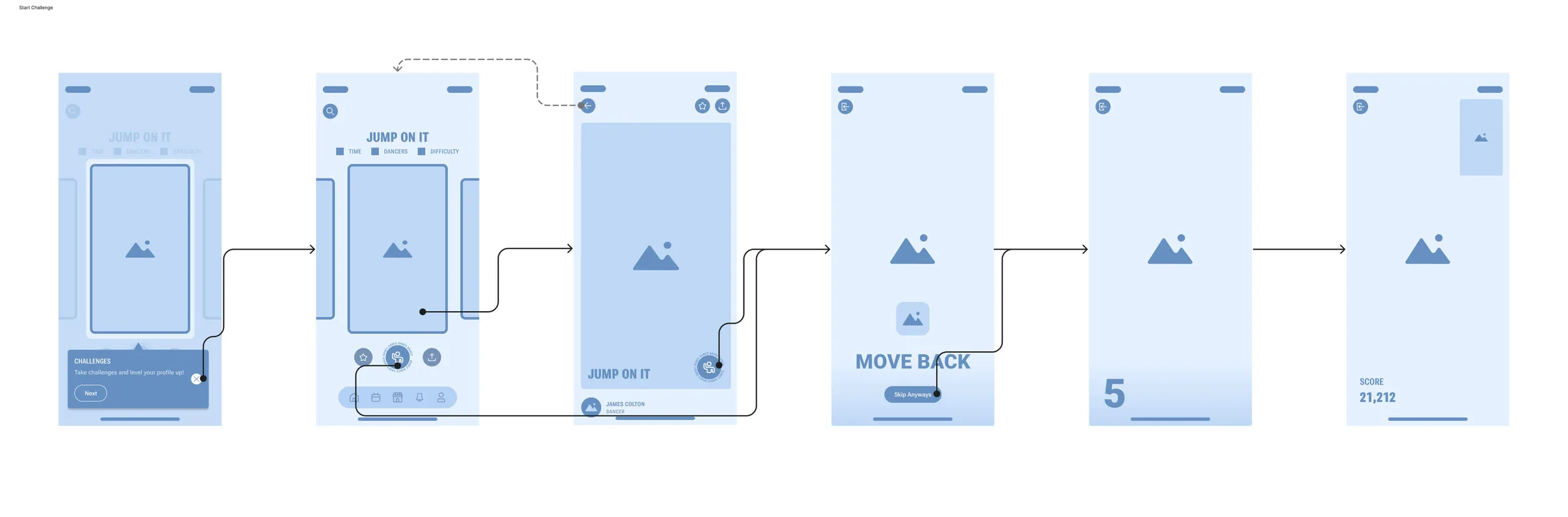
The app existed in Swift and ran on iPhone only. To move faster on both platforms we rebuilt it in Flutter, and the plan ran on two tracks: hold the primary flow steady for the users we already had, and redesign the journeys around it to serve the new strategy.
Eight to twelve weeks, a lean team, a new framework, and two sets of platform expectations to respect. The core flow was what existing users came back for, so breaking it during the rebuild would have cost us the audience the pivot was meant to grow.
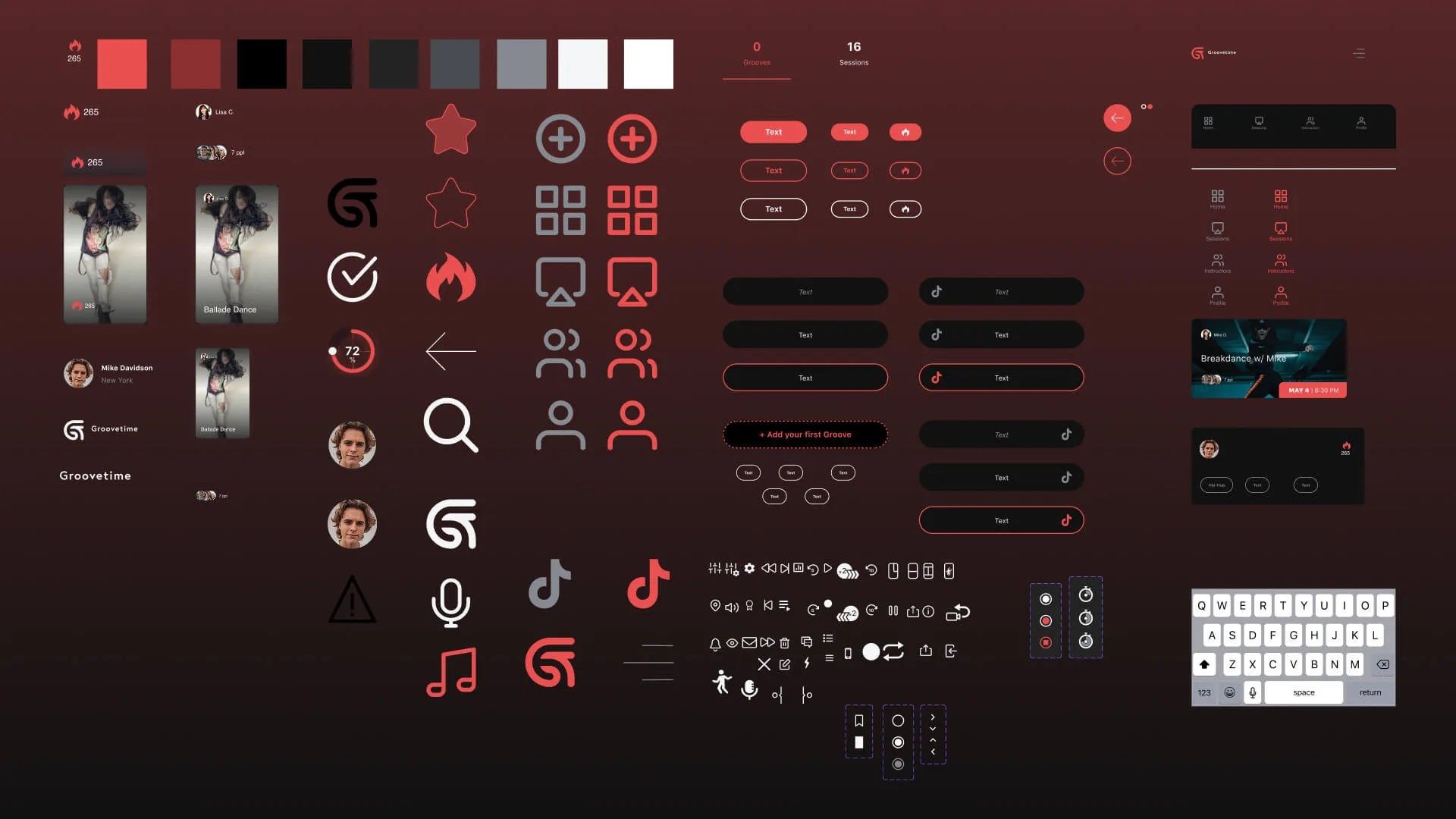
What existed before the systemthe two ways we were keeping screens consistent, and what each cost
- Shared icons and colors
- Enough to make two screens look related. Nothing that told you how to build a third.
- Copying the nearest screen
- Fast, and it carried every inconsistency forward into whatever came next.
Design
Critical Path
What shipped first
Twelve weeks does not allow for a wish list, so the order was the whole decision, and it was mine. I put the foundations in before anything that used them, which meant no engineer ever sat waiting on me for a spacing answer.
- Define success for the main flow → no regressions at launch
- Shared foundations (type, spacing, tokens) → faster, consistent assembly
- Essential components (buttons, inputs, top-level navigation) → unblock daily use
- Daily check-ins on progress → readiness over polish
Scope Cuts
What I protected by cutting
I cut everything here to protect the launch date or the core flow. Documenting an edge case and scheduling it for v2 costs an afternoon; discovering it in week eleven costs the release.
- Advanced effects → after the core is stable
- Edge-case components → document now, build in v2
- Anything risking the timeline without clear user value → defer
I sorted every journey into one of four buckets: keep at parity, rebuild, retire, or create from scratch.
Parity Map
Preserve the core, rethink the rest
The flows existing users depended on had to come back at 1:1 parity. The rest no longer fit the strategy, so I rebuilt, retired or replaced them. Sorting the journeys that way turned a vague rebuild into a finite list of screens, which is what made the estimate believable.
The foundations underneath itspacing and grid rules, and the cross-platform type system
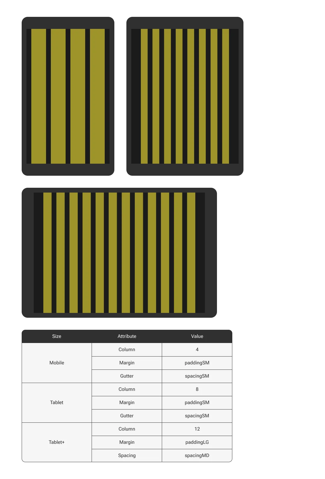
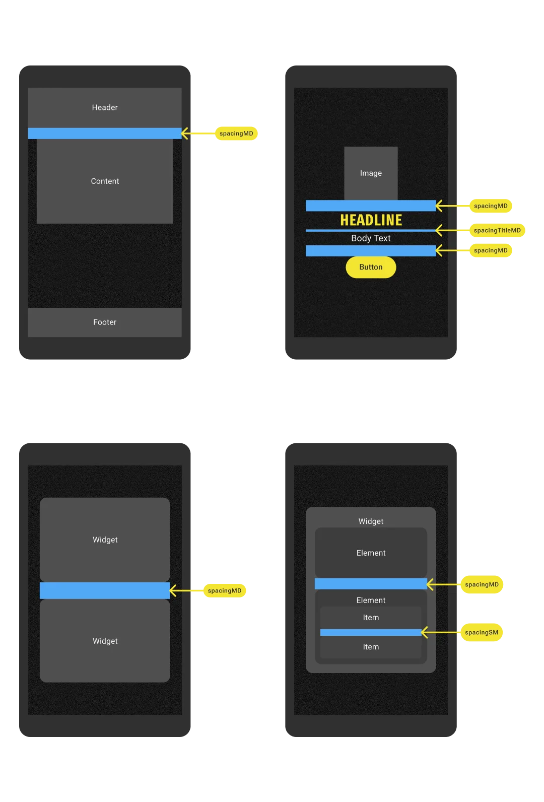
Space and order
Every component and layout mapped to one grid, so elements felt related across screen sizes without each screen negotiating its own spacing. I also fixed the placement logic for buttons, cards, forms and icons, which let anyone assemble a new page in a predictable hierarchy.
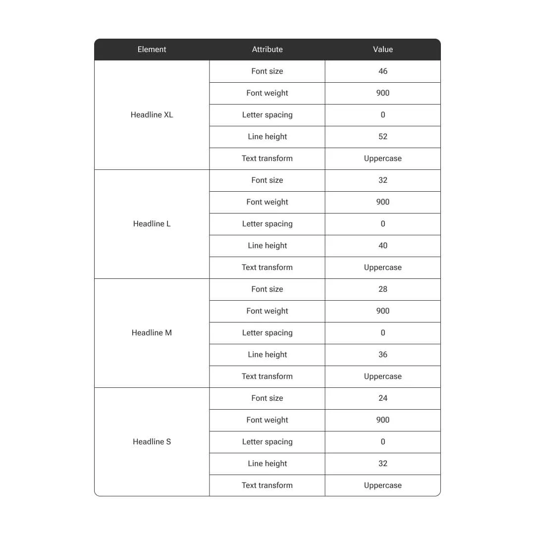
Type that worked on both platforms
Going from iOS only to both platforms broke our type. SF Pro is not available to Android, so leaning on it would have split the experience in two. Variable font support was landing around the same time, which let us ship one distinctive face that rendered the same everywhere and had room to grow.


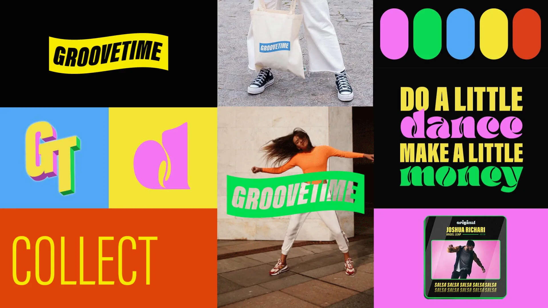
Brand and art directionhow the Web3 pivot turned into blobs, gradients, glass and noise
A voice for a crowded space
The first pivot, in December 2021, put us in Web3, where everything looks the same. Working with our art director Jairo Villa, we landed on a direction built on vibrancy and energy that could carry the identity as it kept moving.
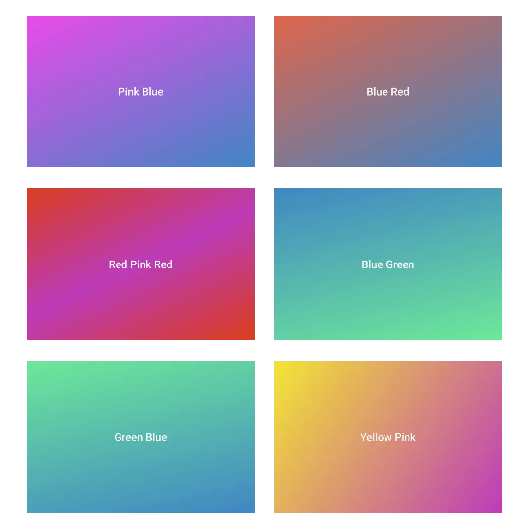
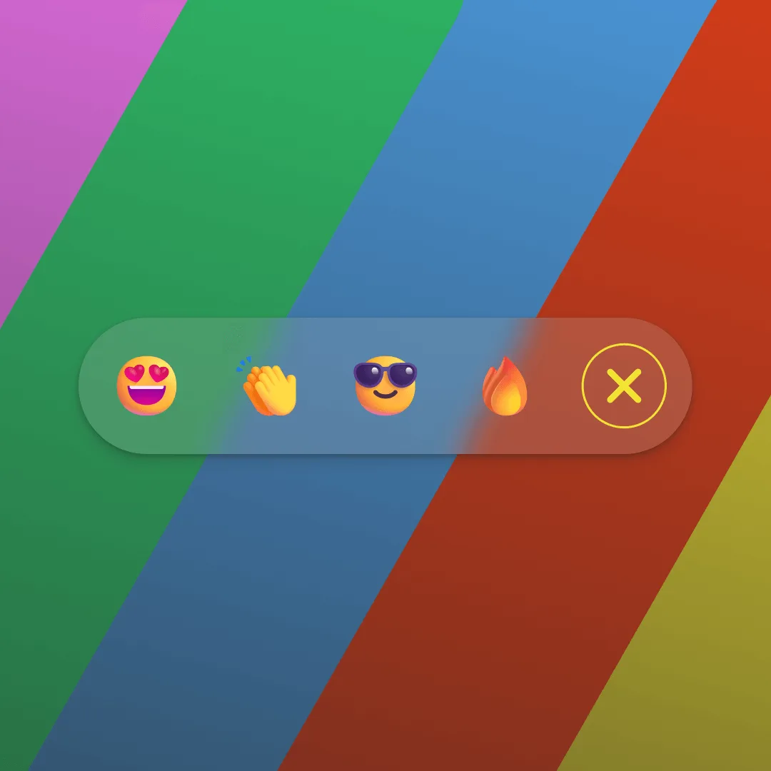
Blobs made it approachable. Gradients carried the energy. Frosted glass gave surfaces depth. A noise texture underneath kept the whole thing from reading as slick, which is what stopped the gloss becoming the entire personality.


Motion, within the budget we had
Motion is where the deadline showed. I took Material Design’s widgets wherever they would do, and spent the time that saved on the few transitions a user would notice.
Documentation, and where the system bentwhat made it usable, and the exceptions real adoption forced
One page per component
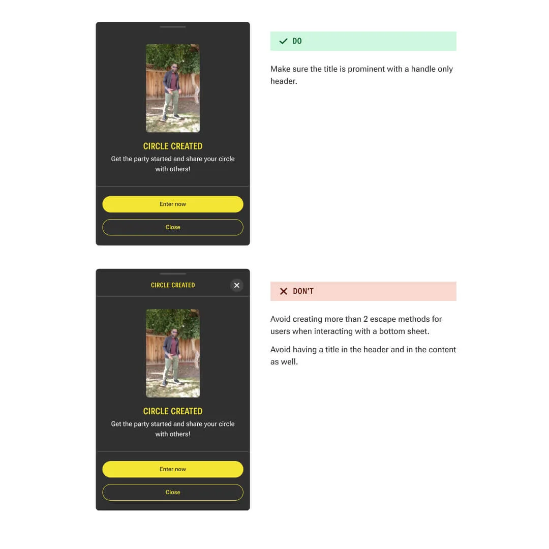
Specs, states, variants and example usages all sat on the same page, so an engineer implementing a button found the lot in one place. That is the difference between a set of guidelines and something a team builds against.
Where it bent
Adoption found the gaps. Developers diverged from the type rules, and some components needed slack the specs did not give them. I wrote down when an exception was allowed and updated the docs as new cases turned up, which kept the system honest instead of letting it rot into a document the team ignored.
Results
Outcome
It shipped inside the window
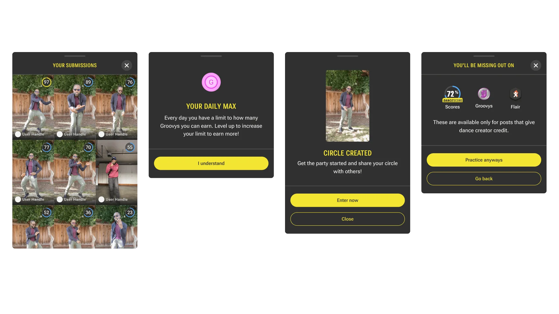
The rebuild landed in the window, on both platforms, and the core flow came back without regressions. The system held: engineers assembled screens from the specs, and the foundations absorbed a full rebrand without anyone renegotiating spacing or type part-way through.
Lesson Learned
Foundations look like overhead until they don't
Nobody asked me to build a design system, and for two months it looked like tidying. The rebuild is what made it legible: the work that had felt optional was the only reason a twelve-week estimate was worth believing.
Next time I would write the exception rules first. I wrote them after adoption forced the question, and each week before that produced divergence I then had to go back and reconcile.
It is also why I could start writing the app’s front end a few months later: with the components specified, building a screen became assembly instead of invention. The full-app breakdown picks the story up there.
Ready to go back to the main page?
Go back