NewFilmmakers Los Angeles
The Donation Page Only the Founder Could Explain
A week spent moving a nonprofit's giving options out of its founder's inbox
Contributions
Visual Design, Information Architecture, Design Strategy
Stakeholders
Larry Laboe
Founder
Timeline
1 week
Overview
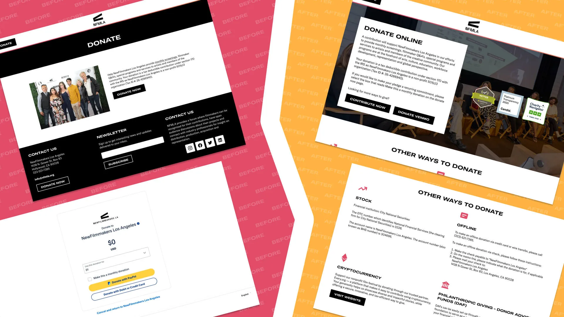
NewFilmmakers Los Angeles is a nonprofit film festival for emerging filmmakers. It already accepted stock, crypto, donor-advised funds, sponsorships and in-kind gifts. None of that was on the website, which had a single Donate Now button wired to PayPal, so the only way a supporter learned their options was to email Larry and ask. I redesigned the page to put what he knew where donors could find it.
My Role
I led the redesign over a week: mapping the flow, deciding which giving methods to surface and in what order, writing the explanatory copy, and building the prototype. Larry reviewed it and confirmed the structure held up without him. The page is live at newfilmmakersla.com/donate.
The short version
- 01Found
One PayPal button, and five other ways to give that nobody could see.
- 02Cause
The options lived with the founder, one email at a time.
- 03Built
A page that names each method and explains what it is for.
- 04Result
He stopped being the only route to a non-PayPal gift.
NewFilmmakers already took stock, crypto and donor-advised funds. Finding that out meant emailing the founder, so this was less a job of adding donation options than of moving what one person knew onto a page that could tell anybody.
Problem
The Bottleneck
One button, and a founder answering the rest by hand
The donate page offered a single primary action, and it went straight to a generic PayPal screen. A supporter reading that page had no way to know the organization would also take appreciated stock, crypto, a grant from a donor-advised fund, an in-kind contribution or a corporate sponsorship.
Those gifts still happened. They happened because somebody emailed Larry, he explained the options, and the donation followed from the conversation. That works until it is the only mechanism, at which point the organization’s giving capacity is capped by one person’s inbox and the larger, tax-efficient gifts are the ones least likely to be discovered.
The PayPal button also flattened everything behind it. Sending a donor to a payment screen with no context stripped out the festival’s voice at the exact moment it was asking to be trusted with money.
How giving worked before the redesigntwo mechanisms, and what each one cost the organization
- PayPal as the only visible route
- Accessible, and a single-path funnel. Every donor who wanted something else had to leave the page to find out it existed.
- Emailing the founder
- It worked, and it made the founder a dependency. Time spent explaining stock transfers is time not spent running a film festival.
What the research turned upconversations with the founder, and a look at how other nonprofits do it
Method
- Informal conversations with Larry about the requests he fielded and the questions that came up most
- Benchmarked nonprofit donation pages for how they present sponsorships, in-kind gifts and planned giving
What it found
- Supporters did not know the alternatives existed, and the ones who did had heard it from Larry
- Donors wanted to know where the money went before choosing a method, which the page never told them
- Nonprofit pages that work tend to carry tiered options, social proof and plain explanations of how funds are used
Design
Structure
Four categories, each with its own reason to exist
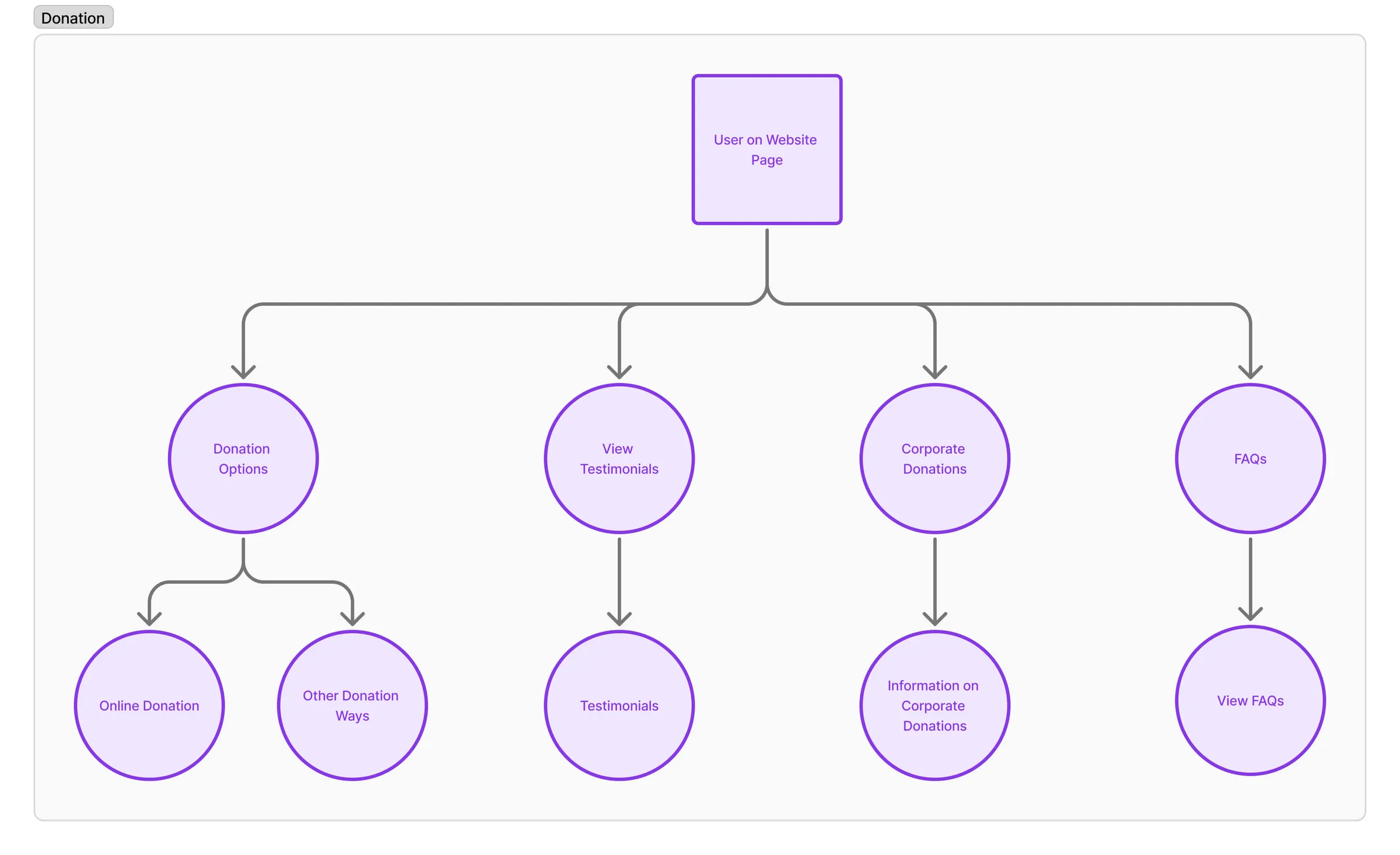
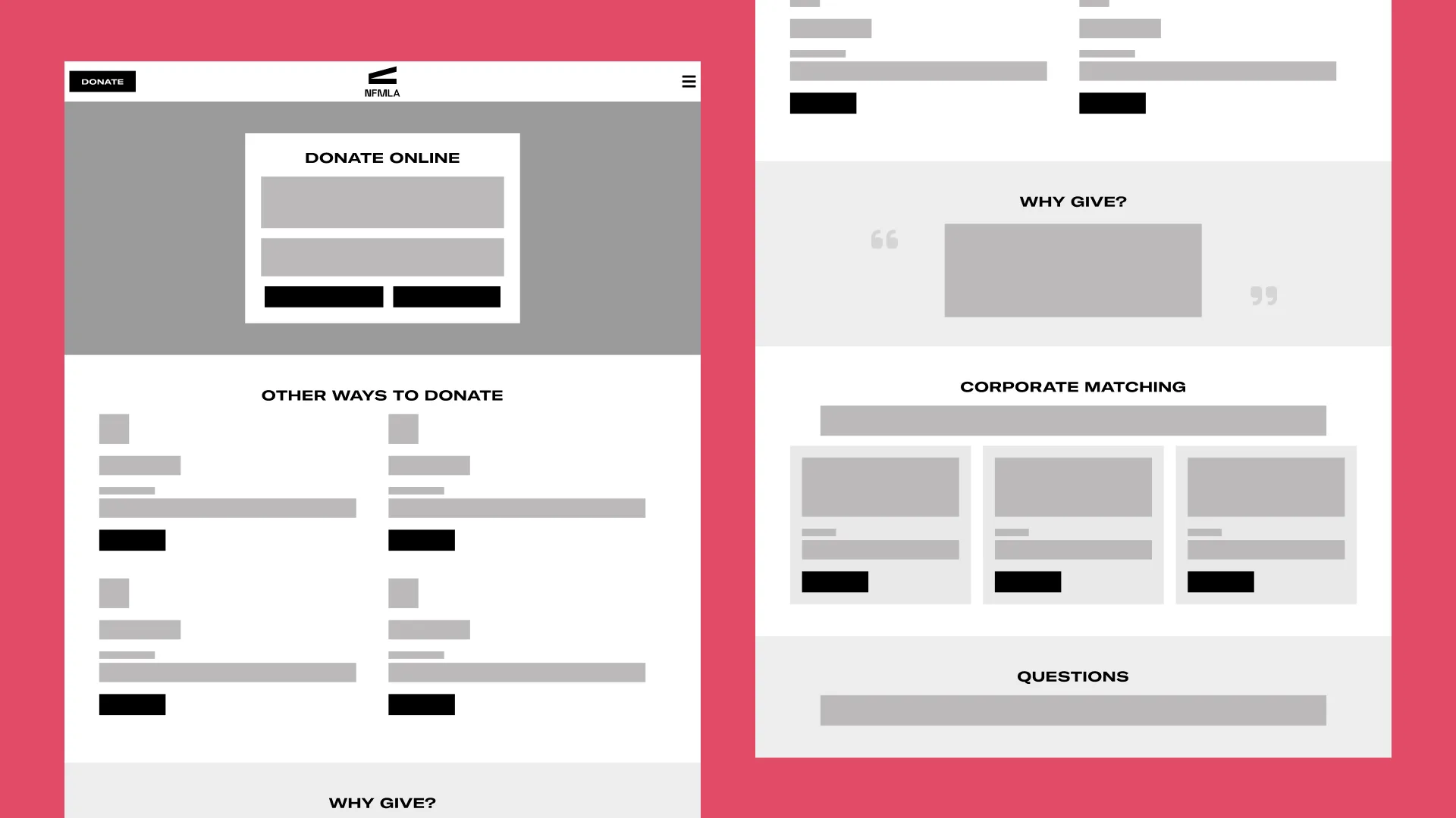
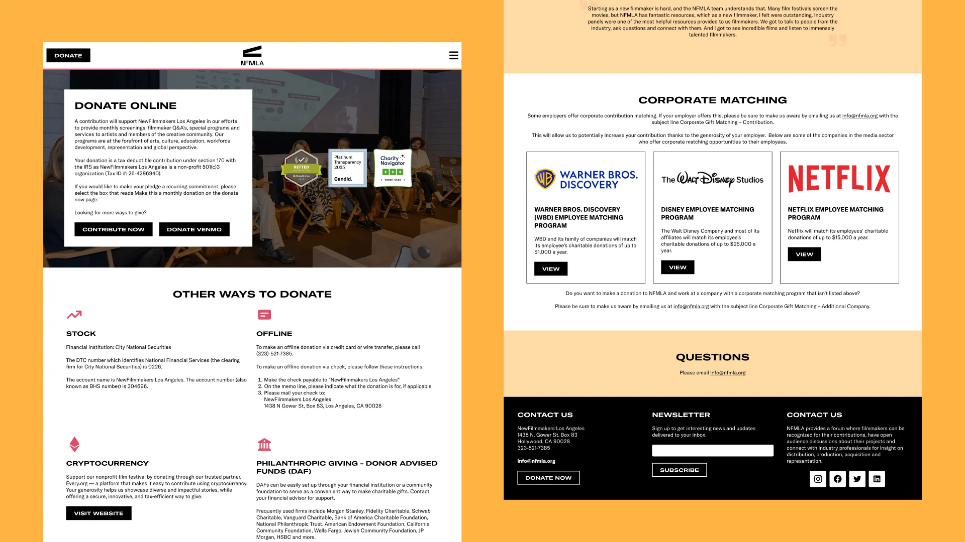
I grouped the methods into Financial Gifts, Stock and Crypto, DAF and Planned Giving, and Offline Giving. The grouping matters more than the list: a donor arrives with an intent rather than a payment method in mind, and the categories let them find the section that matches their situation instead of scanning eight equivalent buttons.
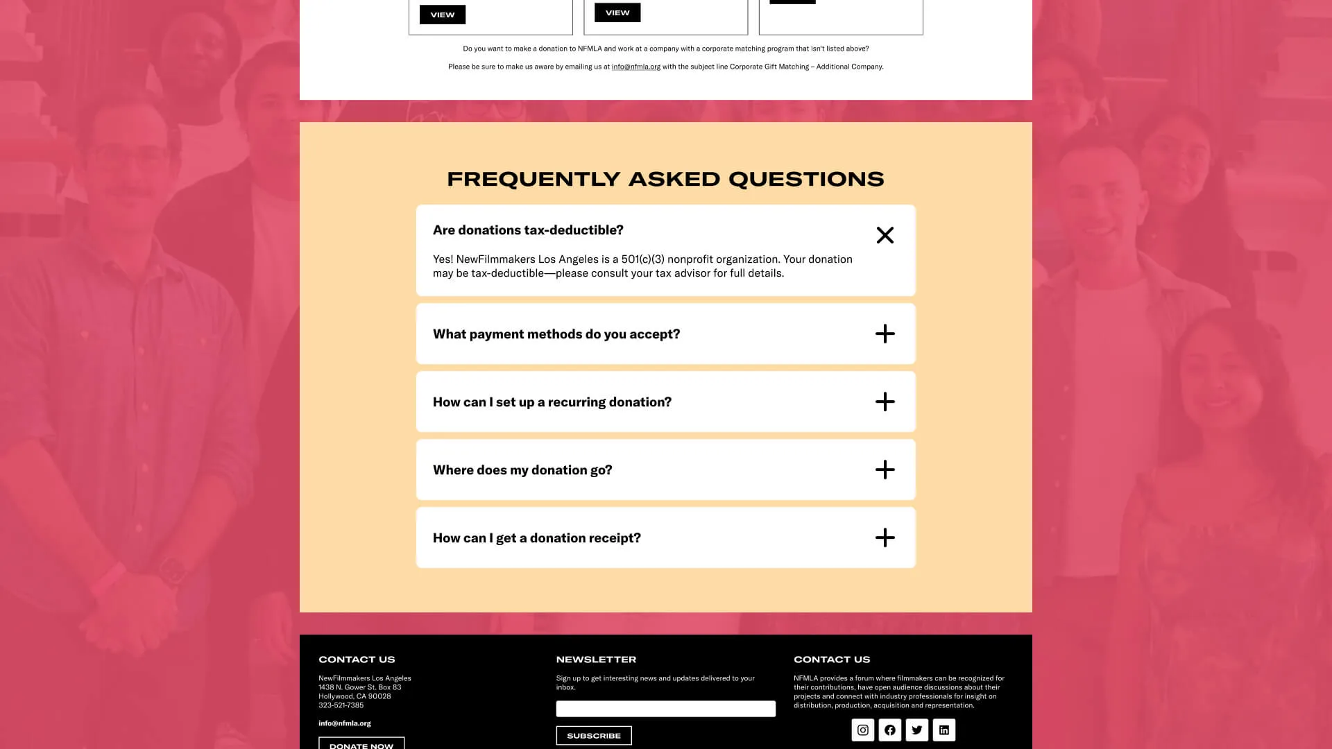
Each method got its own explanation and its own call to action, so the page answers the question Larry had been answering. I added donor testimonials under a “Why give?” heading, because the research kept returning to the same gap: people wanted to know where the money went before deciding how to send it.
The Call To Action
One primary button was the whole problem
The original page had a single Donate Now that led to PayPal, and the effect of that hierarchy was to say the other methods did not exist. Giving each method its own context and its own button was the change that mattered, and everything else on the page follows from it.
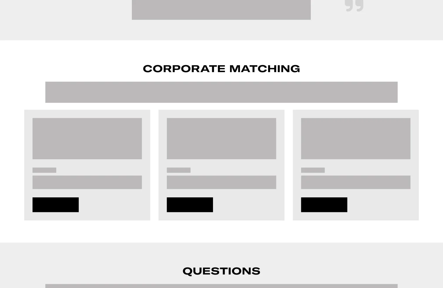
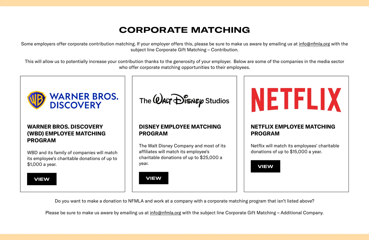
Drag to compare the corporate giving section.
Prototype and reviewwhat I built, and who looked at it
I prototyped in Figma using card and section layouts, with instructions inside each method rather than in a separate help page. Larry reviewed it and confirmed the grouped headings and benefit-forward copy made the options readable without him in the room.
That review is the extent of the validation. On a one-week nonprofit project the founder was the only person who saw the prototype, so nothing here was tested with donors, and I would not describe the structure as validated beyond the person who had been fielding the questions.
Results
6
ways to give, visible without asking
Stock, crypto, donor-advised funds, sponsorships, in-kind and PayPal. The page showed one before this.
4
categories they sit in
Financial Gifts, Stock and Crypto, DAF and Planned Giving, Offline Giving, so a donor picks by intent rather than by payment rail.
Outcome
The founder stopped being the documentation
Larry reported fewer questions about how to give, which was the point of the exercise. The page also became something the organization could send to donors and partners rather than a step they had to talk somebody through.
The redesign shipped and the page is still live at newfilmmakersla.com/donate, still built around separate routes: crypto, donor-advised funds, stock, wire transfer, check and recurring gifts each have their own place on it.
What I Cannot Claim
No instrumentation, so no numbers
I have the founder’s report and nothing else. Nobody put analytics on the giving methods, so I cannot tell you whether the donation mix shifted, whether the tax-efficient options got used, or how many people read a section and gave through it. An earlier version of this write-up said donors stopped defaulting to PayPal out of habit, and I have no basis for that.
I would put a click-through count on each giving method now. It costs nothing and answers the only question that matters: which of these five routes anybody wanted.
Lesson Learned
A working button is not an answer
The old donate page functioned. You could press the button and money would arrive, and convenience was the part that already worked. It could not tell a supporter what their options were or where the money went, and a person answering emails was covering that gap.
The lesson I took is that a page can work and still be offloading its job onto somebody. Larry’s inbox was the missing half of that interface, and it did not show up in any audit of the page itself.
Ready to go back to the main page?
Go back